Alabamy Bound

Introduce yourself here, tell us about your house and interests. Share some pictures.
phil
Has many leather bound books
Posts: 4616
Joined: Tue Aug 18, 2015 6:11 pm
Location: Near Vancouver BC

Re: Alabamy Bound

Post by phil »

awomanwithahammer wrote:We are not authorized to see the pictures of the tiles. They must be really something to require special authorization!


lol at first I thought he was messing with us and uploaded that image from a link to an external site... But I think it was in the gallery , broken link perhaps. Is this it?
Attachments
Aqua tile.jpg
Aqua tile.jpg (30.94 KiB) Viewed 1571 times

phil
Has many leather bound books
Posts: 4616
Joined: Tue Aug 18, 2015 6:11 pm
Location: Near Vancouver BC

Re: Alabamy Bound

Post by phil »

Manalto wrote:Phil, swamp coolers only work when you're not already sitting in a swamp.


good point. Our summer place gets really hot about august but it is dry there, we even have tumbleweed and little cacti No rattlesnakes. they exist if you go in any direction about 50 miles but not there, not sure why. same climate.

User avatar
awomanwithahammer
Knows where blueprints are hidden
Posts: 911
Joined: Fri Jan 22, 2016 1:19 am
Location: Maryville, TN

Re: Alabamy Bound

Post by awomanwithahammer »

Oh, there it is! I didn't even think to look in the gallery. Pretty color!
Bonnie

User avatar
Manalto
Inventor of Knob and Tube
Posts: 2113
Joined: Tue May 16, 2017 11:09 pm

Re: Alabamy Bound

Post by Manalto »

awomanwithahammer wrote:Oh, there it is!


1998

And here it is not lying on its side.

phil
Has many leather bound books
Posts: 4616
Joined: Tue Aug 18, 2015 6:11 pm
Location: Near Vancouver BC

Re: Alabamy Bound

Post by phil »

that looks nice for the shower, Is there enough?

User avatar
GinaC
Forgotten more than most know
Posts: 437
Joined: Sat Jan 26, 2019 8:19 pm
Location: Newport, VT

Re: Alabamy Bound

Post by GinaC »

My goodness, that tile is gorgeous! Then again, it's my favorite color so I may be biased. :)
1939 Minimal Traditional

User avatar
Manalto
Inventor of Knob and Tube
Posts: 2113
Joined: Tue May 16, 2017 11:09 pm

Re: Alabamy Bound

Post by Manalto »

GinaC wrote:My goodness, that tile is gorgeous! Then again, it's my favorite color so I may be biased. :)


When I realized it's a dead ringer for Tiffany blue, I looked it up and learned it's the same as robin's egg. I remembered you're fond of that color and plan to use it on your kitchen cabinets.

Phil, I just moved the tile into more convenient boxes and did a rough count and there are at least 360. At 9 tiles per square foot that's 40 square feet. I'm rethinking the shower project and may use this in the laundry room with an olive green tile that I already have.

2000

The colors are a little off in this image, maybe because of the artificial lighting. I really like the combination (love those tertiary colors!) but I'm sure it's not for everybody. I was thinking I would do the robin's egg tile in the laundry room to about 55 in high with a double band of olive near the top.

phil
Has many leather bound books
Posts: 4616
Joined: Tue Aug 18, 2015 6:11 pm
Location: Near Vancouver BC

Re: Alabamy Bound

Post by phil »

colors are a personal thing, one tile I really like is a very dark sort of royal blue or cobalt blue, and I like tangerine orange. or butter yellow with it.
wall colors are easy to change. tile is not. I try not to go too loud because loud colors can affect the resale value. my house is orange but it is an earthy tone and not a strong disturbing color, the trim is all brick red. That combination fits the era, but there are very few orange houses. The tangerine I used is actually very similar in color to the finished color of Douglas fir. in most rooms I put a hint of the wall color in the ceiling paint and it has an effect with reflection , hides the line between the ceiling and wall color. I can't stand pink. I was convinced to paint one room baby blue. Hated it so I changed it. I htink if you use that tile it will need some other wall color or something else to compliment it. It feels 50's to me , reminds me of a two tone 57 Chev in aqua blue or almost turquoise and creme white.

I think if you follow auto colors it helps show what was kind of trending in different eras. you wont really find too many old 30's and 40's cars in weird bright outlandish colors. into the 50's they got louder. now they are all metallic silver. sometimes I find radios and things in certain sort of olive green and know it dates to about mid 50's but did not seem too popular earlier or later than a certain date. olive seemed to return in combination of fall colors, orange red etc as a sort of 70's theme.
I hate that stark Ikea white, they use a lot of today.. I dont have much furniture that is blue so anythign blue seems to not fit my house. One room can be quite different than others though. It's not necessarily a bad thing if your bathroom is quite different than the rest of the house. I think dark colors make me feel like I'm in a cave as they reduce light reflection. most bathrooms have pretty bright lights and often a larger ratio of window area. I put in a 3 bulb fixture and my girlfriend unscrews two of them ;-) My take is that if that's all we have to worry about we are doing OK ;-)

phil
Has many leather bound books
Posts: 4616
Joined: Tue Aug 18, 2015 6:11 pm
Location: Near Vancouver BC

Re: Alabamy Bound

Post by phil »

back when I was trying to figure out how far down the walls to make a color change and add a picture rail someone went into the descriptions of how from roman architecture it is about proportions. as I worked on the iving room I found that it had some wainscott all around the room. I then visualized a line around the room at eyeball height and evidence showed that was the height of the transition between wainscott and plaster walls.

I noted that this height worked well with how it intersected windows, how some windows were divided. It made me realize that in my house eyeball height was a sort of magic number that worked with the other proportions in my living room and that was about 66 inches. I dont know if 66 inches works in some magic proportion to the ceiling height of 9 feet. I can only describe it as a "comfortable place" for a division in color or a molding to be in my circumstance within my living room.
I think I put the color change at about 17 or 18 inches from the ceiling and Ive yet to add any molding but intended for a picture rail on this division of paint colors. I painted the walls a pale green and the ceiling looks white but it is actually a pale grey color. If there is a complicated color it is grey. people think it's a combination of black and white but grey is a mixture of percentages of different colors and it has many variations. very tiny amounts of any color will affect it. If you try to mix grey, it is mostly white with a tiny bit of other colors that affect it.

in rooms of your house, there is an effect of light bouncing off the walls and all around and combining in ways that are a bit hard to visualize and predict. color has a big impact on mood so I htink if colors are cheerful but not overpowering they can have a positive impact. Here in Vancouver many find a difference in mood with sunshine and abou this time of year we change the clocks this weekend and the weather breaks, you can see people walking around with smiles on their faces as if they just came out of hibernation..

I was reading how light affects plants. James probably knows more about this,, but the topic I found interesting was that in the spring, that warm color we get as we near dust is different as the seasons change. in late summer it is more an orange color. It said if the red spectrum was increased about an hour before dusk, then the plants flowered as they used the color balance of light in their decision when it was time to flower. the plants are also sensitive to the hours of light.

User avatar
Manalto
Inventor of Knob and Tube
Posts: 2113
Joined: Tue May 16, 2017 11:09 pm

Re: Alabamy Bound

Post by Manalto »

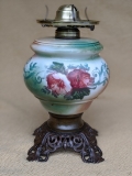
When I found the pair of oil lamps that I posted a few days ago, I came across another oil lamp that I hesitated on because it's missing its shade and chimney. I liked it though, with its Victorian-style detail and large reservoir.and it was only $10, so I pounced. Aside from missing its upper china/glass, it has some splits in the metal band just above the base but they don't seem to be bad enough to weaken it. Here it is, after a little cleaning:

2191

I think the flowers are meant to represent hibiscus or some member of the mallow family (Rose of Sharon?). Since my guessing game with the pair of oil lamps was such a hit, I thought I'd try again with another inquiry to those who know more about this sort of thing than I:

What kind of shade and chimney goes on this lamp?

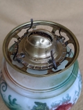
If it originally had a shade that was painted to pair with the base, that is lost to history. What would be a good compromise for shade (and chimney)? Here is the burner and ring, which is a 4 1/4" fitter.

2192

Any estimates on its age? Late 19th?

Post Reply